Case Study
Designing a Trustworthy Interface for Understanding California Wildfire Activity
A case study on designing a public data interface that prioritizes clarity, transparency, and responsible interpretation of historical wildfire data.
Overview
This project explores how historical wildfire data can be presented in a way that supports clear understanding while reducing the risk of misinterpretation.
The interface focuses on California wildfire incidents from 1992–2020, using publicly available data to examine patterns in reported fires across time and geography.
Rather than optimizing for exploration alone, the design prioritizes clarity, transparency, and responsible data framing.
Context
Wildfire data is widely used in public discourse, policy discussions, and media reporting.
However, raw datasets often contain inconsistencies in reporting, classification, and completeness.
This creates a need for interfaces that not only display data, but also guide interpretation responsibly.
- Assume trends directly reflect real-world changes
- Compare regions without accounting for reporting differences
- Misinterpret aggregated metrics such as total acreage burned
Objective
To design a public data interface that:
- Supports accurate understanding of historical wildfire activity
- Reduces the likelihood of misinterpretation of reported data
- Communicates data limitations clearly and without ambiguity
Approach
1. Clarity of Structure
Information is organized to separate context, data, and interpretation.
This ensures users can quickly understand what they are viewing before interacting with the data.
2. Transparent Methodology
Data processing steps are explicitly communicated to improve trust by making transformation visible.
- Standardization of county names
- Simplification of cause categories
- Handling of missing values
3. Responsible Interpretation
Interpretation guidance is embedded throughout the interface to prevent common errors.
- Assuming reported trends equal real-world change
- Comparing regions without considering data completeness
- Overinterpreting aggregate metrics
Key Design Decisions
Interpretation at the Point of Use
Instead of placing all explanations at the top, cautionary guidance is positioned near charts and maps.
This ensures users encounter context while interacting with the data, not only before.
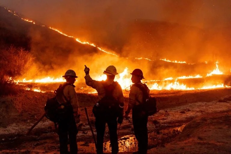
Reduction of Visual Bias
The interface avoids visual choices that can skew interpretation.
- Dramatic imagery
- Strong visual emphasis
- Unnecessary decoration
Separation of Insight and Data
A single key insight is presented to demonstrate how the data can be interpreted, without overwhelming users with conclusions.
Explicit Data Limitations
The interface communicates critical constraints in the underlying dataset.
- Reported incidents may not reflect actual wildfire occurrence
- Regional differences may be influenced by reporting practices
- Historical records may contain gaps or revisions
Outcome
The resulting interface functions as a public information system, not just a dashboard.
The project demonstrates how data visualization can be used not only to present information, but also to shape how that information is understood.
- Explore wildfire data
- Understand how the data is structured
- Interpret patterns with appropriate caution
Tools & Data
- Data Source: US Forest Service FPA-FOD (1992–2020)
- Frontend: Next.js, TypeScript, SCSS
- Visualization: D3.js
Interpretation Notes
Source
Sources used in this write-up
- Data Source: US Forest Service FPA-FOD (1992–2020)
- Frontend: Next.js, TypeScript, SCSS
- Visualization: D3.js
Methodology
How findings were formed
Updated
Most recent context
Scope
What this shows
Scope
What this does not show
Definition
Directional evidence
Reflection
This project reinforced the importance of designing for interpretation, not just interaction.
In public and policy-facing contexts, the role of design is not only to make data accessible, but also to ensure it is understood correctly and responsibly.